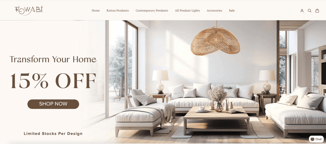
Static banners can often be overlooked, especially on content-rich websites. They have limited ability to convey information due to space and design constraints. This can reduce their effectiveness in attracting attention and delivering messages.
Attention-Grabbing
Animated banners attract users' attention with movement and effects.
Modern and Creative
Banner give a professional and creative impression, enhancing brand image.
Conveys More Information
They can show multiple frames or dynamic content in the same space.
NEW UI DESIGN
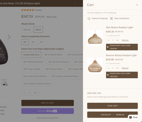
Bad layout design
The cart's cluttered layout and lack of clear prioritization make it difficult for users to quickly identify key details.
Poor Information Hierarchy
The unclear grouping of product details, price breakdown, remove button … reduces its visibility, potentially leading to user frustration and hesitation during checkout.
Call to Action
"View Cart" and "Checkout" buttons are less prominent, reducing their visibility.

